Amsteldok
BRANDING—TYPOGRAPHY
2018—2020
Amsteldok is new home of the leading communication services, WPP. Not only did the identity need to capture the creative DNA of all 15 of WPP’s Dutch agencies and their sum total of 1500 employees, it also needed to establish the campus as an important new landmark in the city of Amsterdam. The end result was a total brand identity immersed into every aspect of the campus – from logotype, iconography, wayfinding and tone to custom furniture, interactive installations and statement walls.
This project has been shortlisted and awarded by organisations such as Brand Impact Awards, Clio, Transform Awards, Eurobest, Cannes & D&AD
Created by Superunion


COLLABORATION
Monotype ︎︎︎
Acrylicize ︎︎︎
AWARDED
ADCN ︎︎︎
European Design Awards ︎︎︎
Transform Awards ︎︎︎
Communication Arts ︎︎︎ Eurobest ︎︎︎
Clio ︎︎︎
Brand Impact Awards ︎︎︎
D&AD ︎︎︎
SHORTLISTED
One Show ︎︎︎
Cannes ︎︎︎
FEATURES
Brand New ︎︎︎
Monotype ︎︎︎
LINKS
Amsteldok opening press release ︎
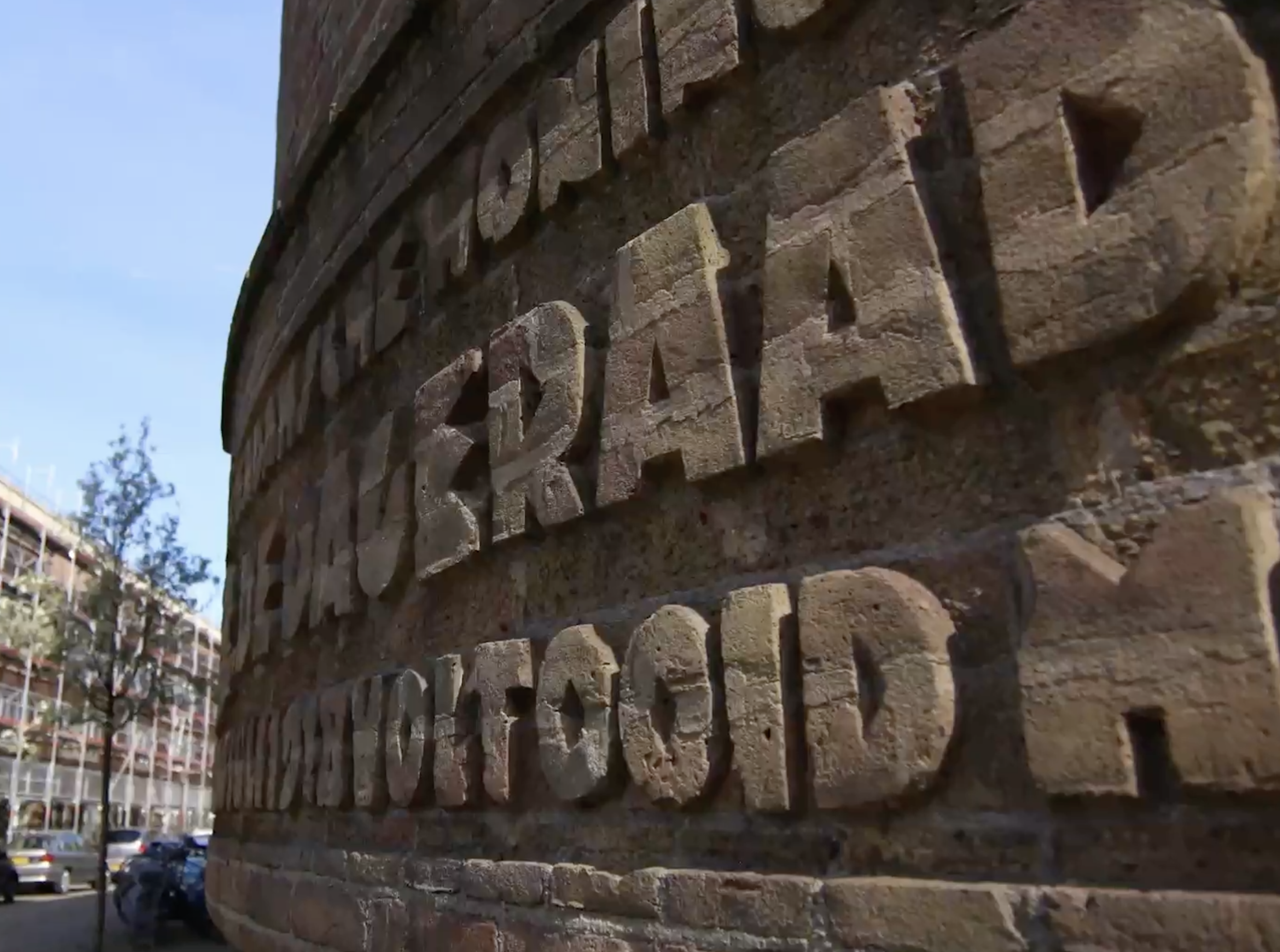
A Identity forged on dutch spirit and historic reference.
Our brand typeface is heavily inspired by traditional Amsterdam style typography, found primarily in the neighbourhood around the campus. This typeface was modernised and crafted to breathe with variable capabilities.


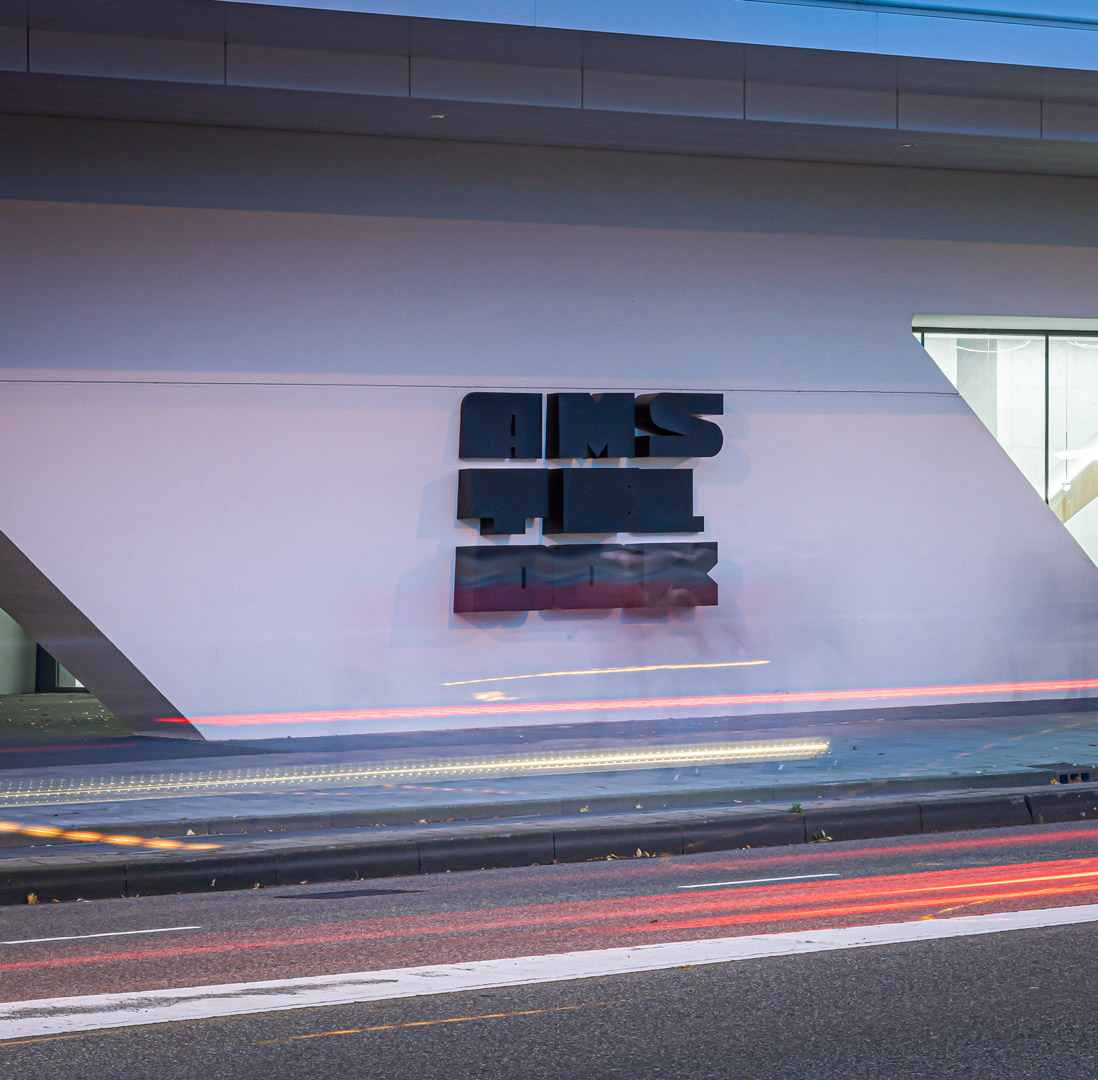

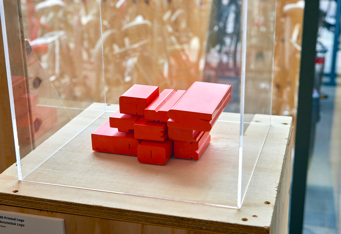
Our logo doesn't only breathe in the 2D world but also in 3D.

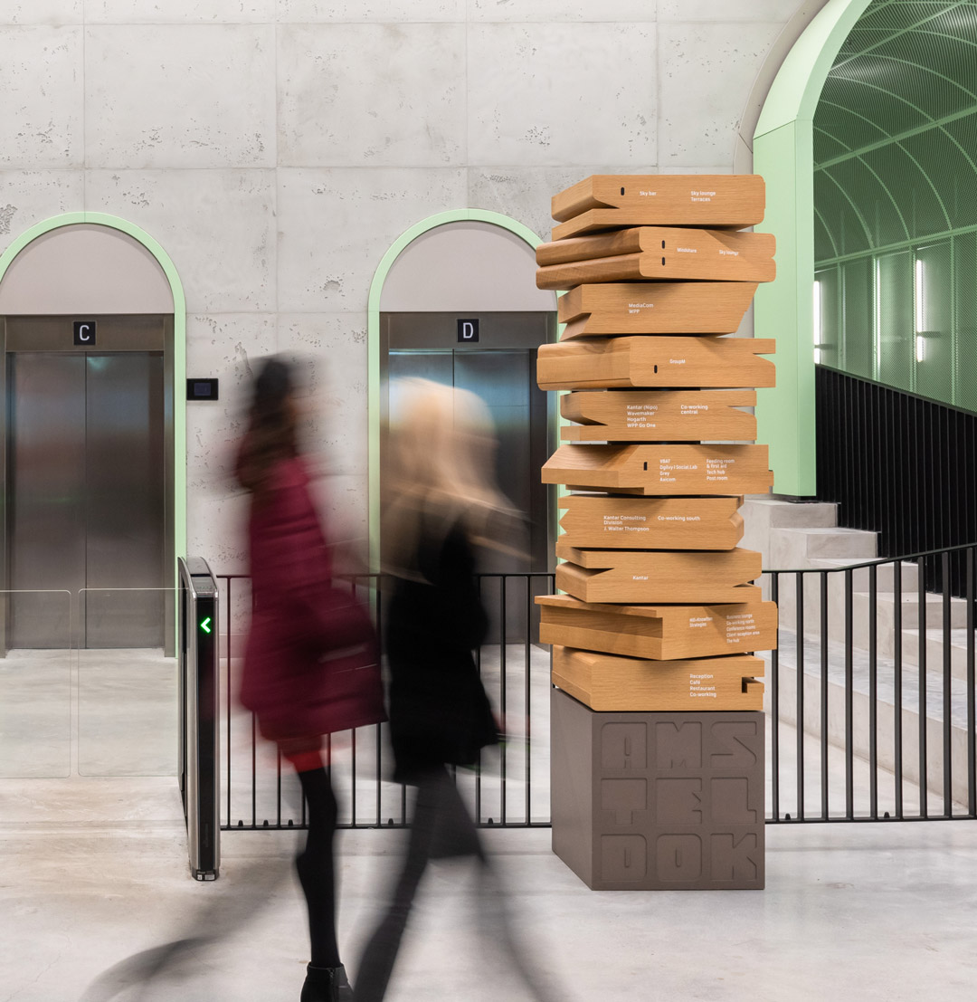
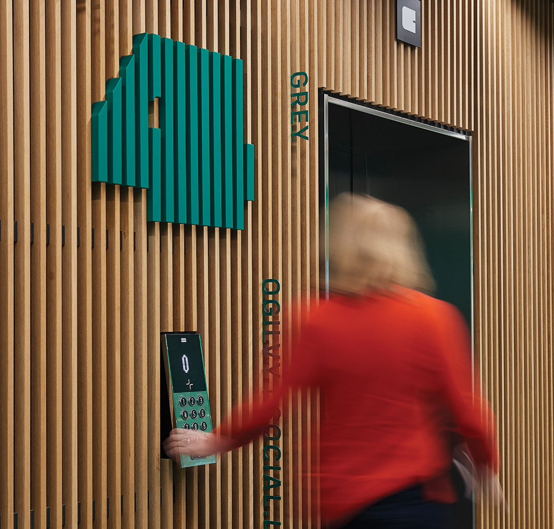
Integration of the typography is implemented throughout the campus.


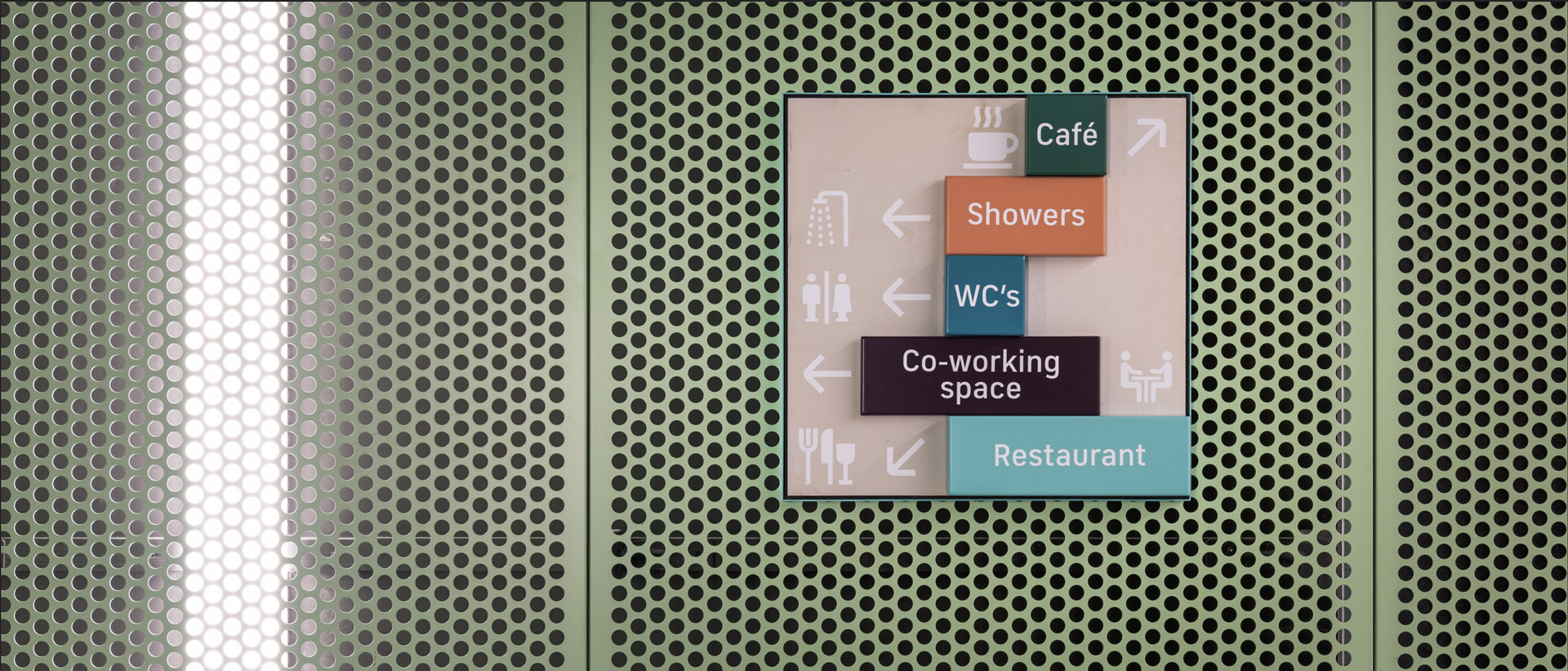
The wayfinding is built on a breathing grid system and embodies our brand making it vibrant and identifiable throughout the building.